
Single Storey House Extension in Chelmsford, Essex
(Kitchen relocation + open-plan kitchen / day room for modern family living)
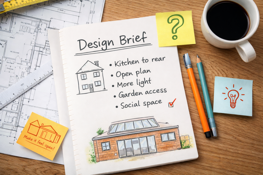
1) The Design Brief
This project started with a really common problem in family homes: the kitchen was at the front of the house, while the garden and the “nice bit” of the plot sat at the back. The clients are a family who love having people round, and they wanted the house to work the way they live day to day — cooking, chatting, kids coming and going, friends dropping in, all without everyone being split across different rooms.
The brief was simple and clear: move the kitchen to the rear, open everything up, and create one big, social space that feels bright, relaxed, and connected to the garden. They didn’t just want “more space” for the sake of it — they wanted the right space. Somewhere you can make dinner while still being part of the conversation, keep an eye on the kids, and open the doors in summer so the house and garden feel like one.
A big part of the brief was natural light too. The clients wanted the new room to feel uplifting all year round, not gloomy in winter, and not like an afterthought stuck on the back. It had to feel like it belonged — both inside and out — and from the outside they wanted it to look smart and confident, not boxy or temporary.
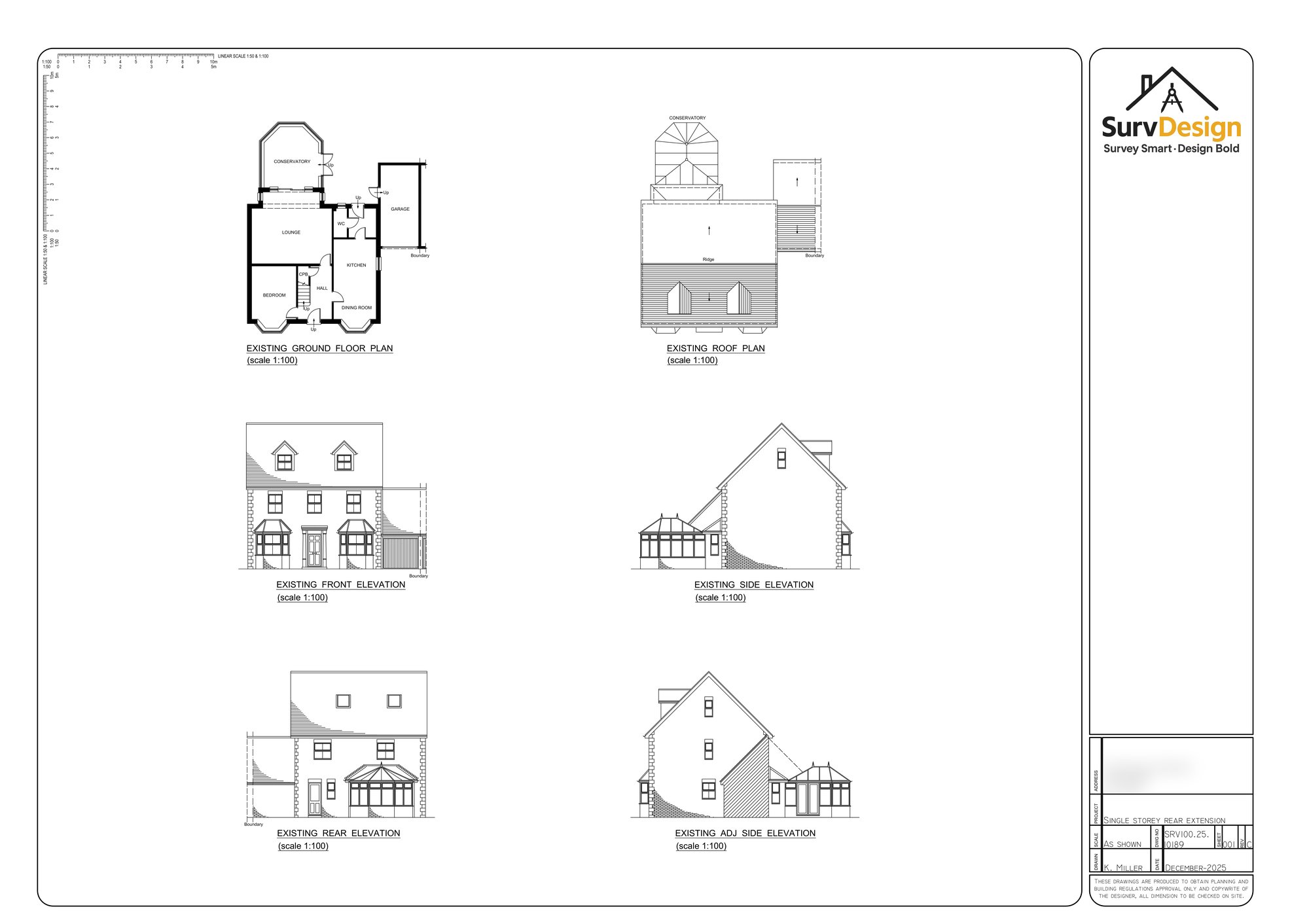
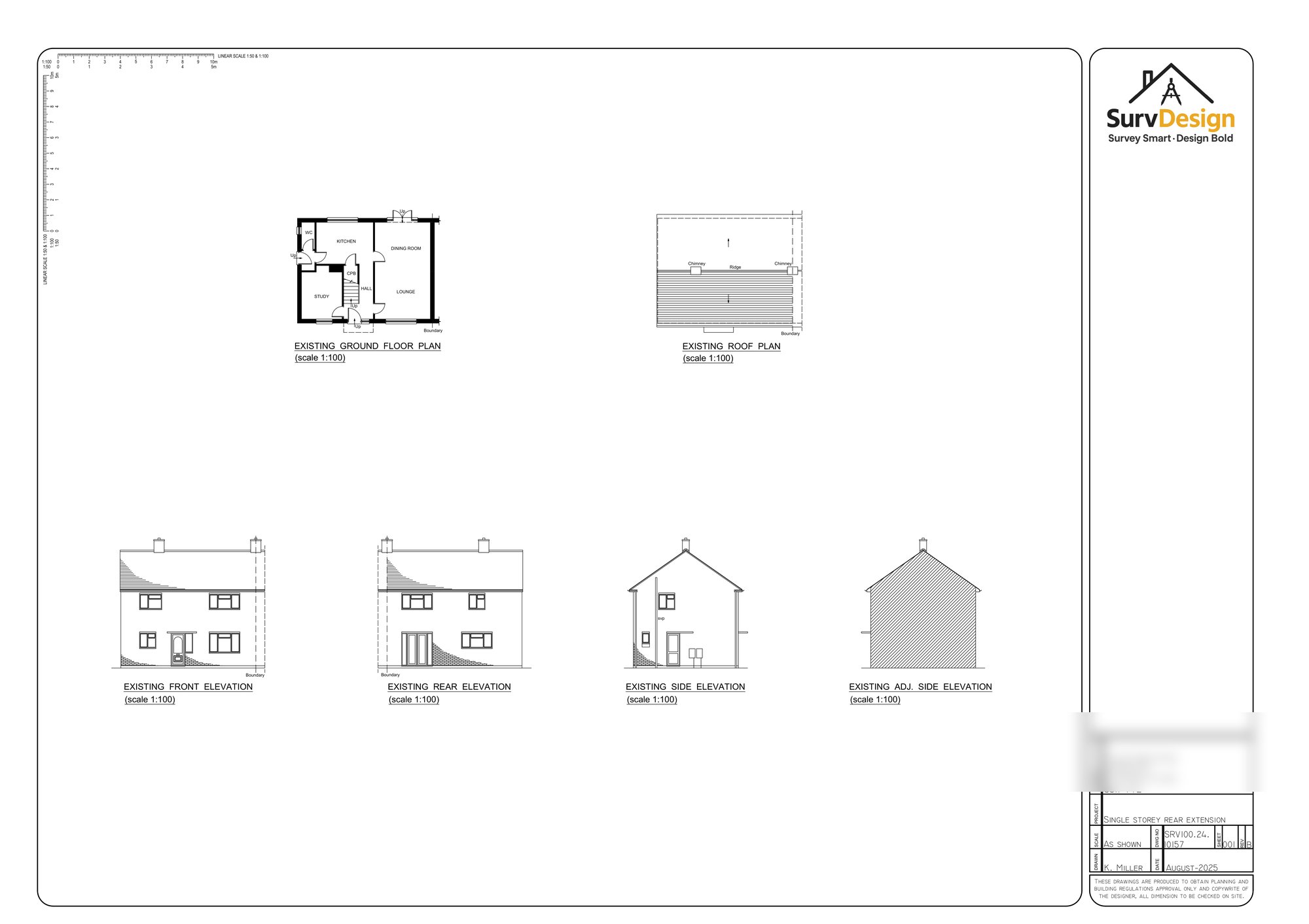
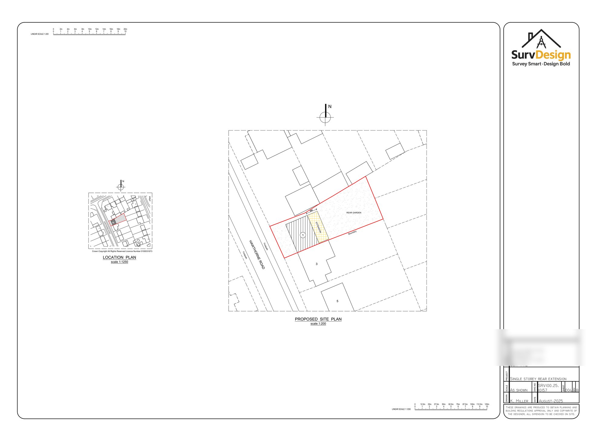
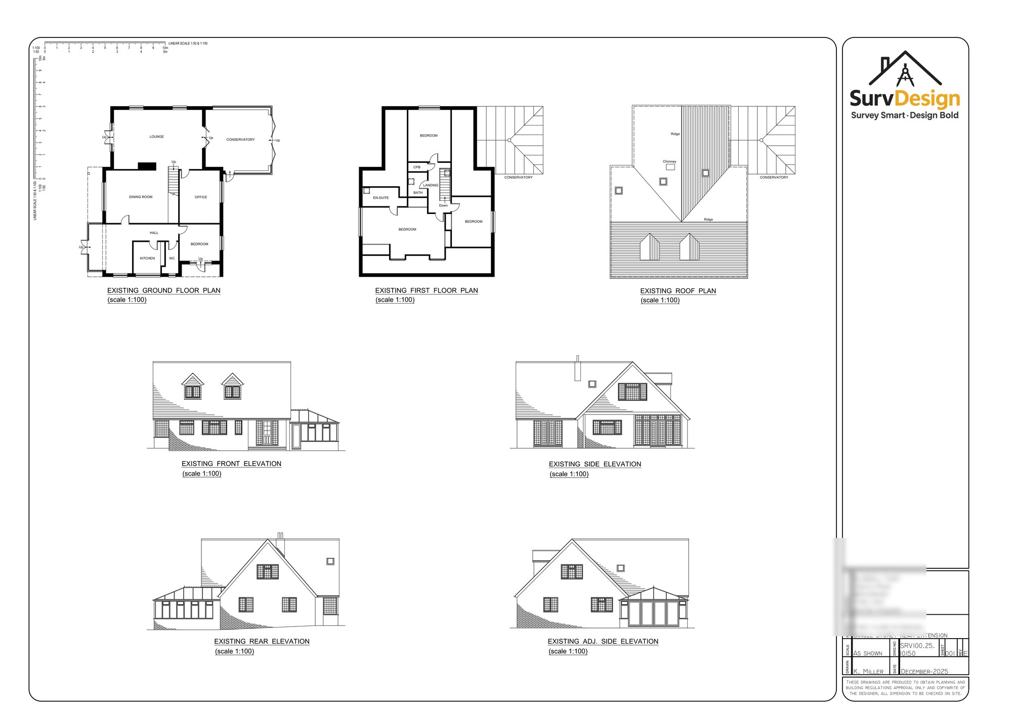
2) The Existing Layout
Before the work, the ground floor had the typical “older layout” feel. The kitchen was positioned at the front of the house, which meant day-to-day life happened away from the garden. The main rear area was served by a conservatory, which gave extra space, but it didn’t feel properly integrated with the rest of the home.
And that’s the thing with conservatories: they can be useful, but they often don’t behave like a real room. Too hot in summer, too cold in winter, and the layout around them can end up a bit awkward. In this case, it created a separate rear zone rather than a proper open-plan family space.
The clients also felt that the flow of the house didn’t match how they wanted to use it. Spaces were more compartmentalised, and entertaining meant moving between rooms rather than everyone naturally gathering in one welcoming, central area. They wanted to change that feeling — to make the rear of the house the “hub” and make the home feel more modern and connected.

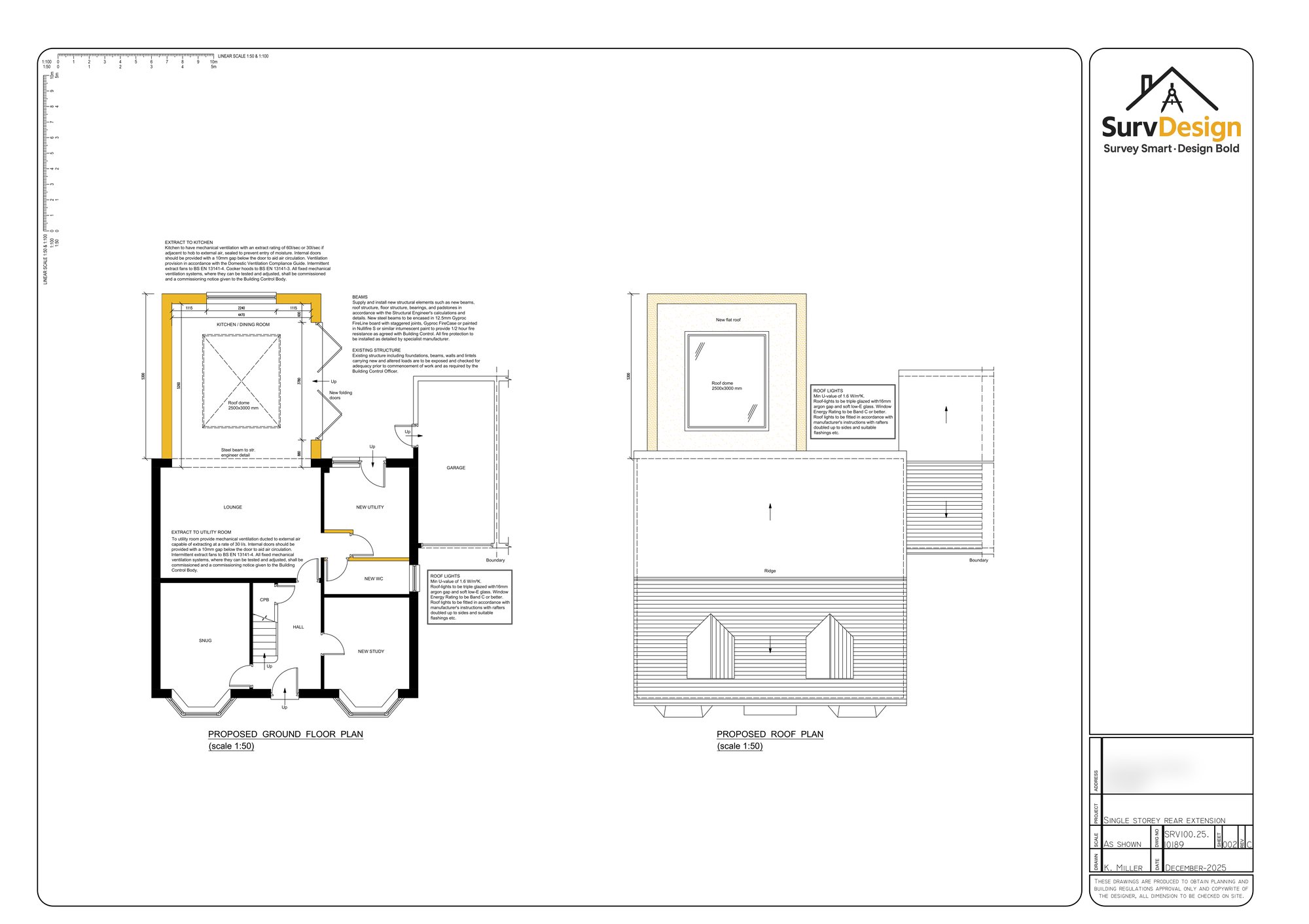
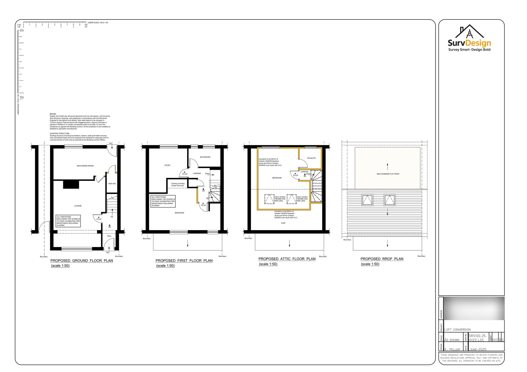
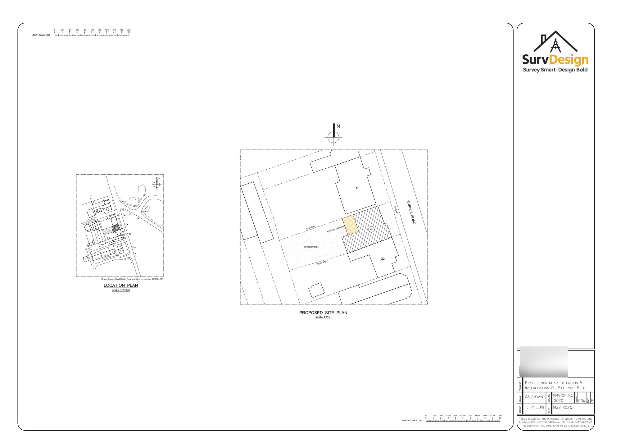
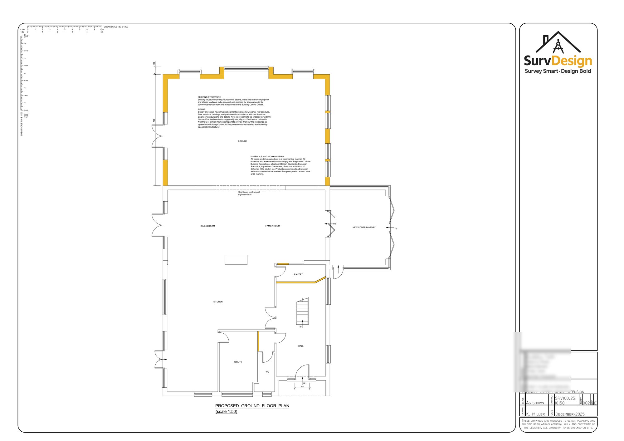
3) The Proposed Layout
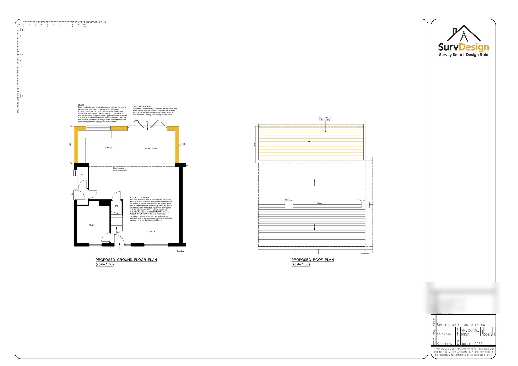
The proposed design is a single storey rear extension that completely changes how the home works — without losing the character of the original building. The key move was relocating the kitchen to the back and building the extension around that idea: a big open-plan kitchen / dining / day room that opens directly to the garden.
Once you commit to that, the rest of the layout starts to fall into place. The new rear room becomes the main family space — cooking, dining, lounging, homework at the table, friends round at the weekend — all in one flexible area. It’s that “everyone ends up in the kitchen” vibe, but with enough space that it never feels cramped.
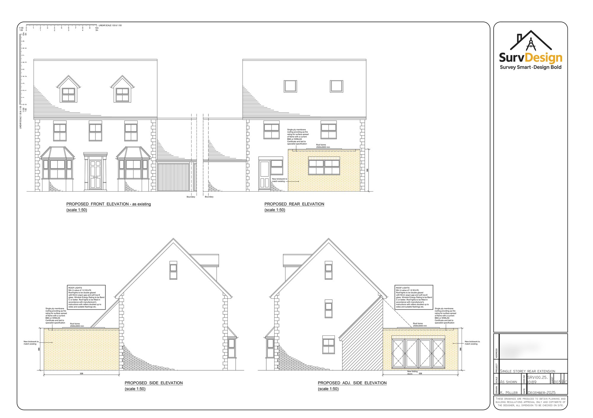
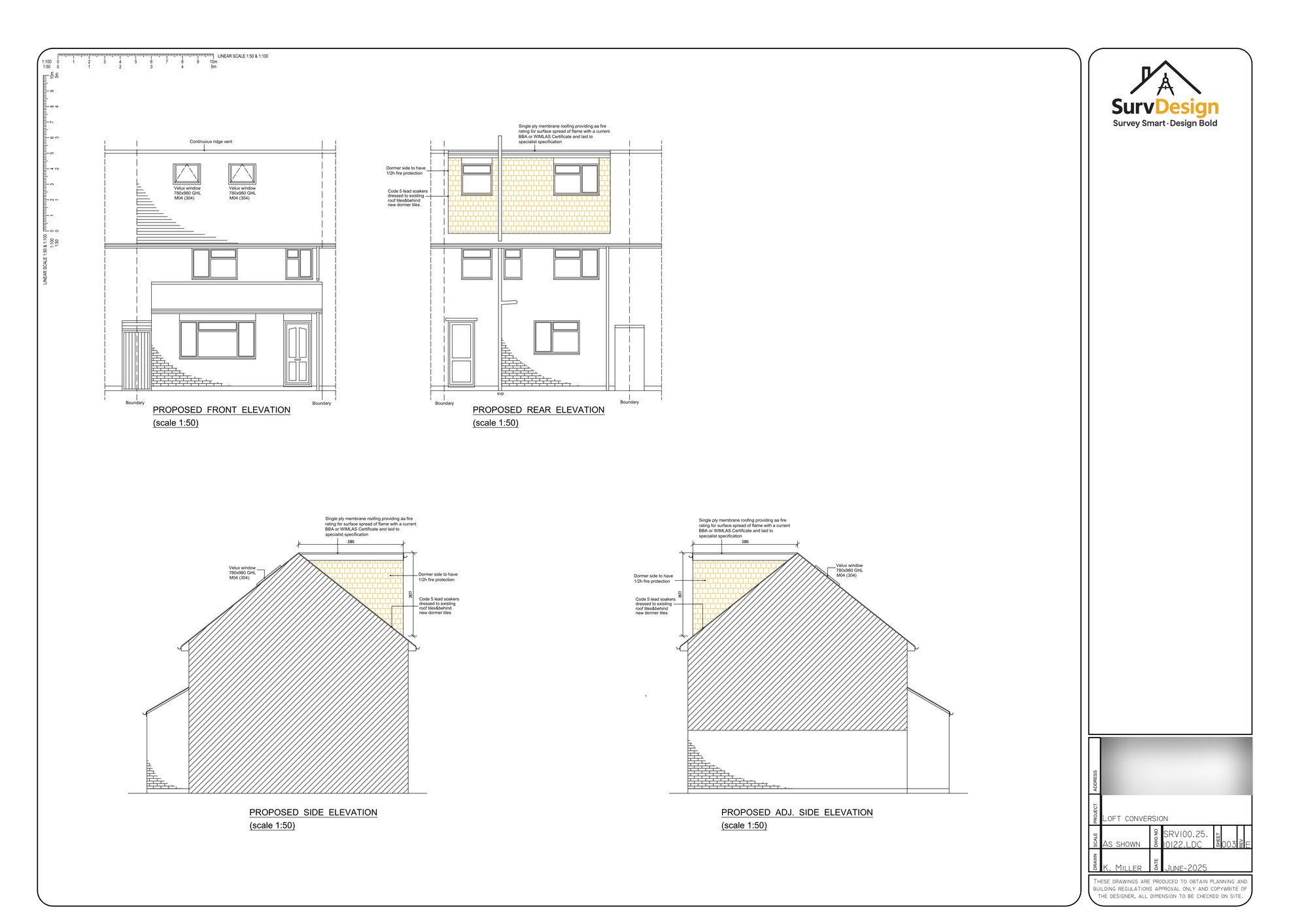
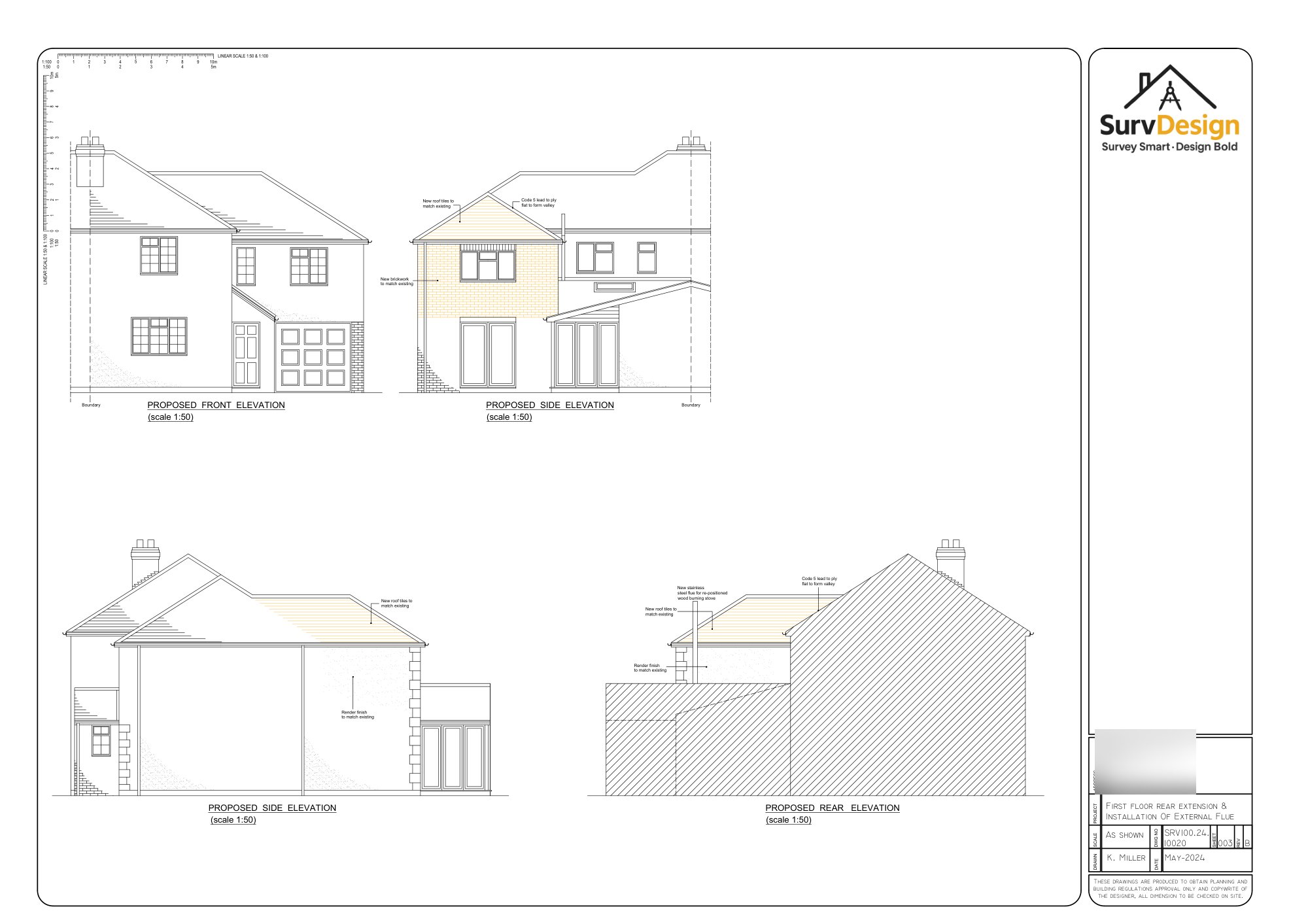
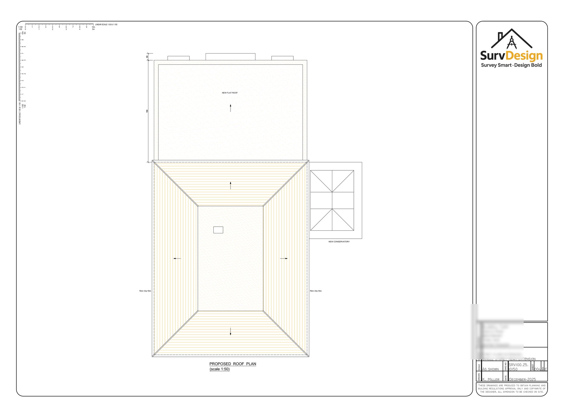
To make sure the extension felt bright and airy, the design includes a large roof lantern set into the flat roof. That was a really important element, because it draws daylight into the centre of the room and gives the space a sense of height and quality, even though it’s a single storey addition. You get that nice natural light shifting through the day — it’s a subtle thing, but it makes the room feel calm and uplifting.
At the garden end, wide bifolding doors were introduced. Again, not just because they look good (they do), but because they change how you use the space. In warmer months the doors fold back and the patio becomes part of the room. Even in winter, you still get that view out, and the room feels connected to the outdoors rather than shutting it off.
Practicality was a big part of the redesign too. Rather than having the main open-plan space cluttered with laundry, coats and everyday mess, we formed a proper utility area and a new WC adjacent to the garage. It’s one of those moves that makes a house feel “grown up” and easier to live in. It keeps the day room clean and social, and gives the home the kind of back-of-house function that makes everyday life smoother.
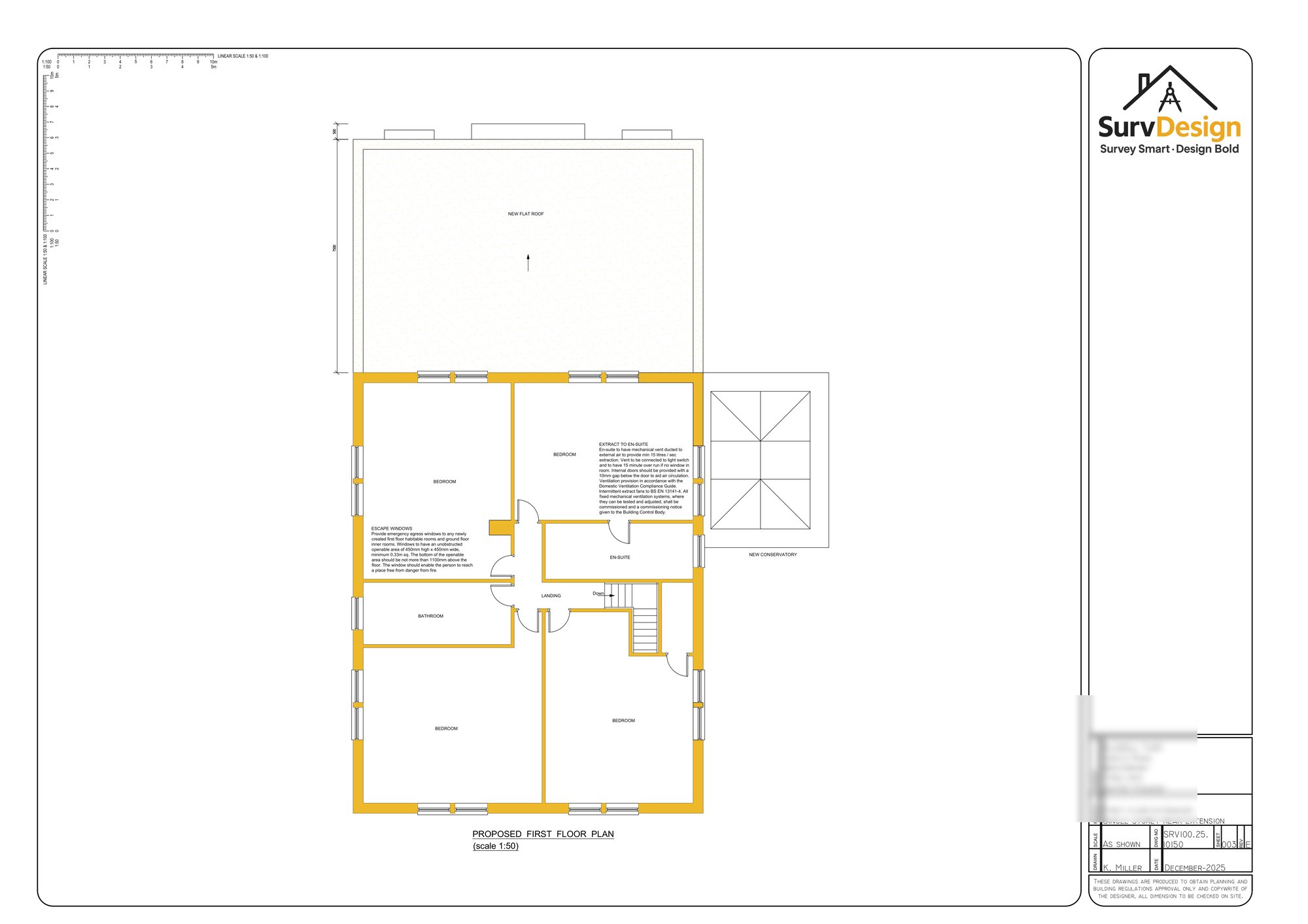
The front rooms were then repurposed to suit modern family needs — creating more flexible, usable spaces such as a study and snug area. That balance is what makes the whole plan work: lively, social space at the back; quieter, more contained rooms towards the front.

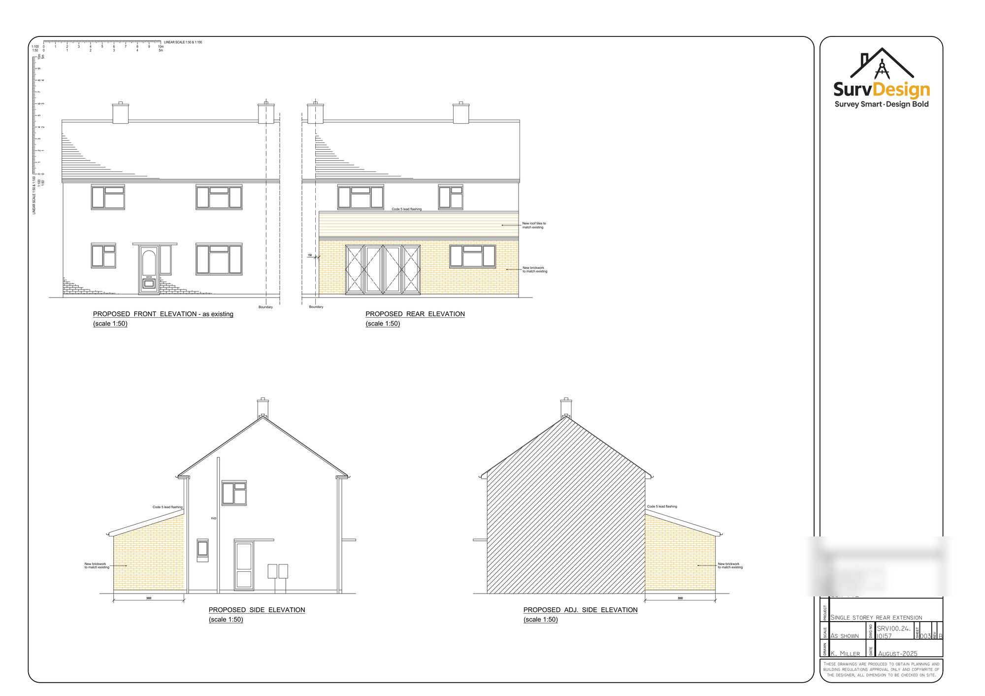
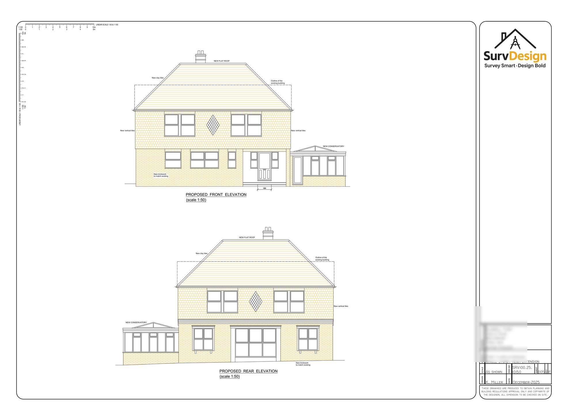
4) External aesthetics and design
From the outside, the goal was always for the extension to look like it belongs. We didn’t want it to shout, but we also didn’t want it to look timid or “tacked on.” The clients wanted the rear elevation to feel more considered, more architectural — something with presence.
The extension is finished in brickwork that matches the existing house, which helps everything sit together naturally. When you’re working with brick, getting that relationship right is key — tone, texture, mortar colour, and the way the brick is detailed around openings. It’s those small decisions that make the difference between something that looks seamless and something that always feels like “the new bit.”
A big design choice here was using parapet walls rather than a traditional roof edge with soffits and fascia. Parapets give a cleaner line, a bit more weight, and a more confident silhouette. It instantly makes the extension feel more “built” and intentional — a bit grander, as the client wanted — while keeping the overall form simple.
The large roof lantern also plays a role externally, adding a contemporary touch without overcomplicating the roof. Combined with the bifolding doors, it gives the rear of the property a modern, high-quality feel — the sort of elevation that looks great in a brochure, but more importantly, works brilliantly in day-to-day life.
The end result is a rear extension that feels solid, well-proportioned, and properly integrated with the original house. Inside, it’s bright, open and welcoming; outside, it looks like it was always meant to be there — just upgraded.
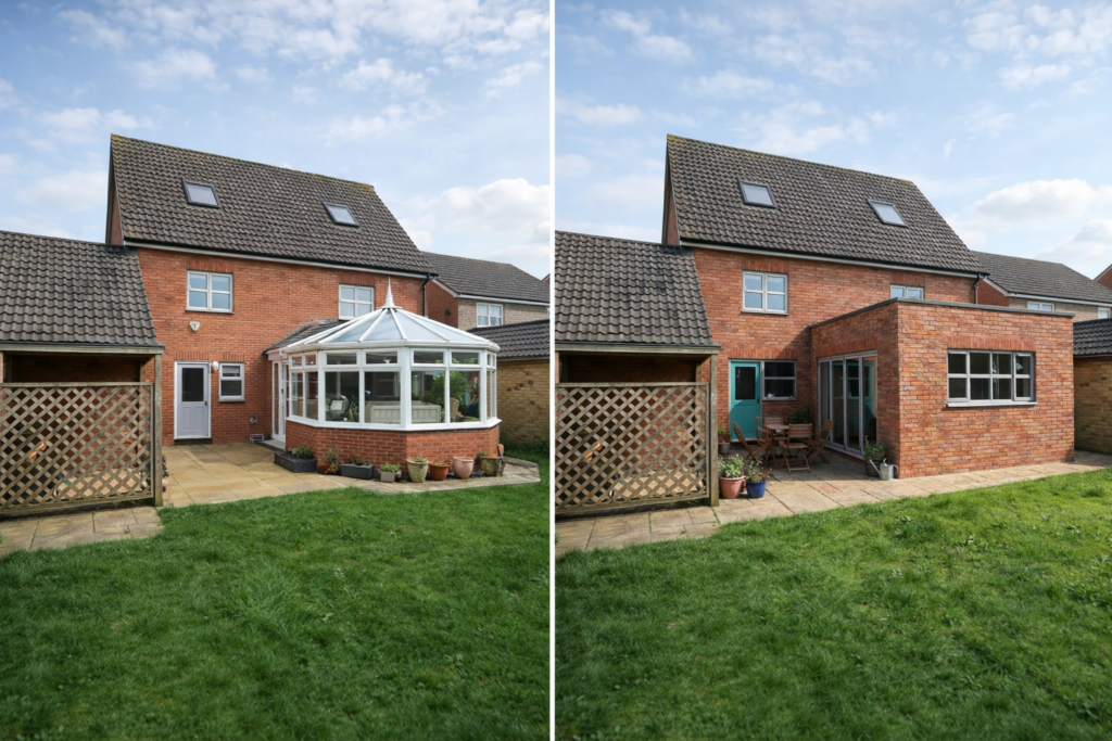
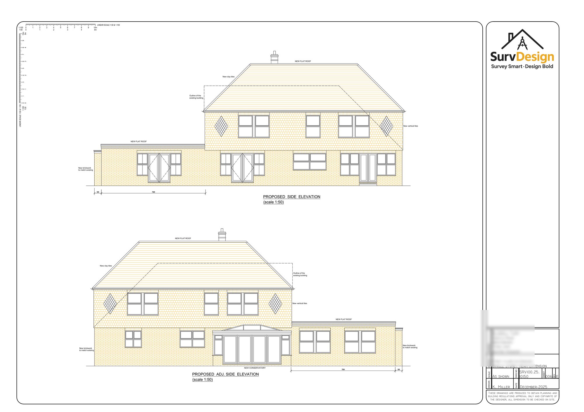
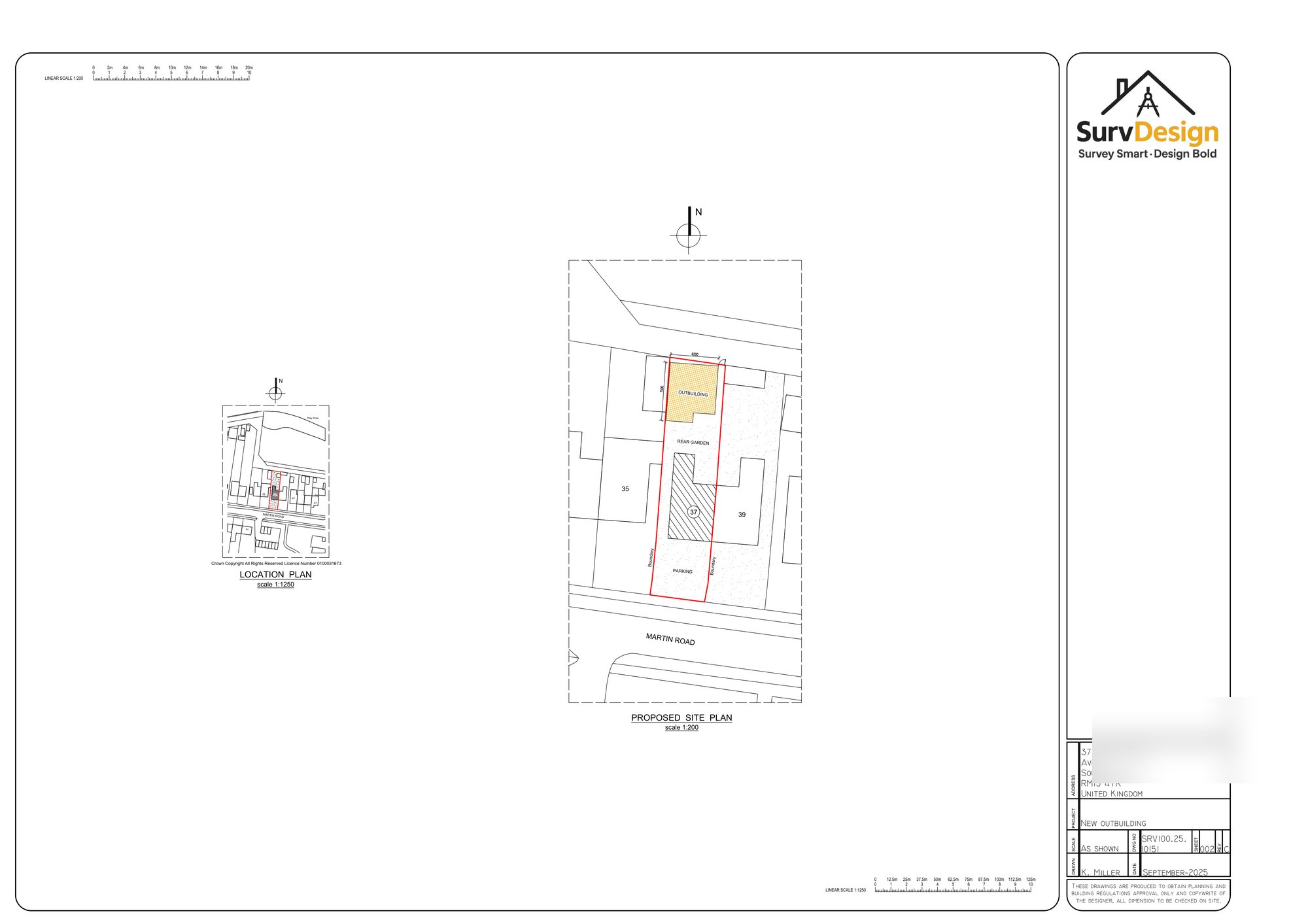
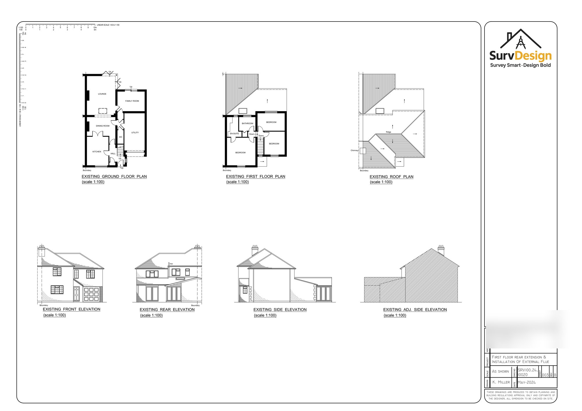
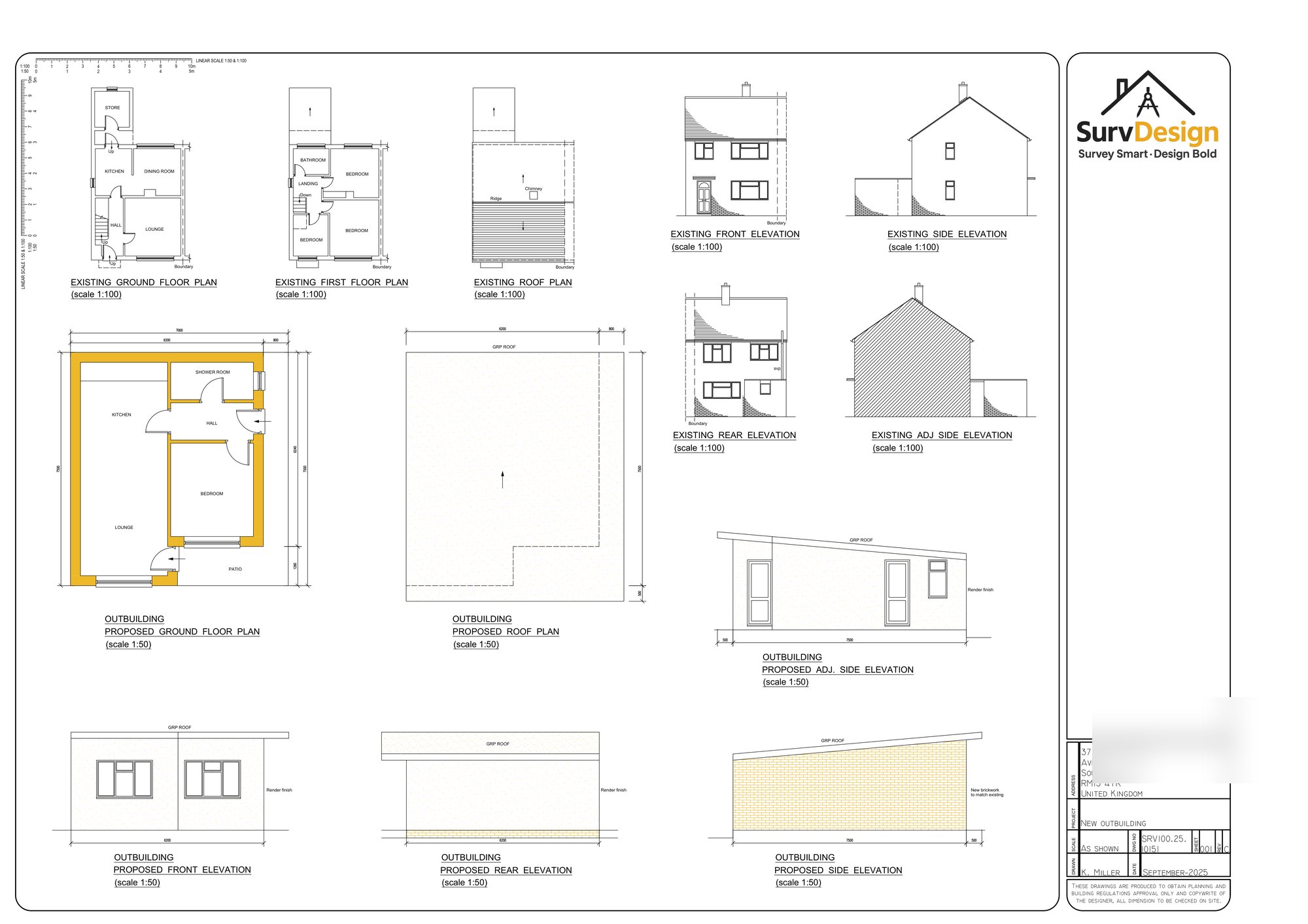
Images Above Showing The Property Before and After The Extension
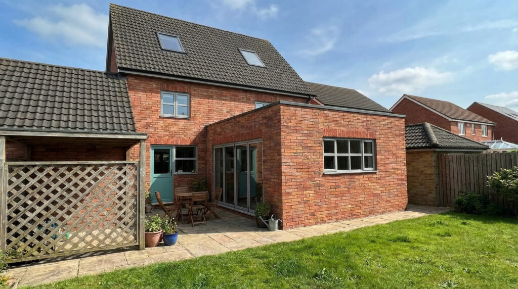
Images Above Showing The Finished Design
Are You Ready To Start Your Home Renovation Project?
If so, we could be surveying your home in no time at all
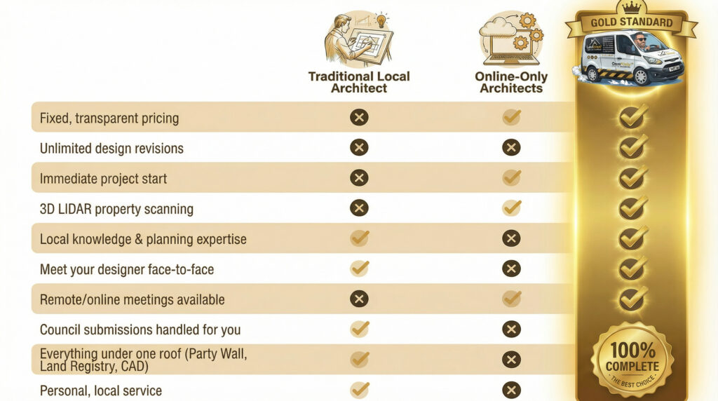
What Makes Us The Gold Standard?

Quick Links
Get In Touch
Building 13, Thames Enterprise Centre, Princess Margaret Road, East Tilbury, Essex, RM18 8RH
- Phone: 0800 494 7023
- Hours: Mon-Fri 8:30AM - 5:30PM
Get In Touch
Building 13, Thames Enterprise Centre, Princess Margaret Road, East Tilbury, Essex, RM18 8RH
- Phone: 0800 494 7023
- Hours: Mon-Fri 8:30AM - 5:30PM